Your Packaging Is the First Handshake, the Last Impression, and the Most Tangible Proof of Your Brand.
At Awful Great Design, we believe packaging is not merely a vessel — it is a high-stakes encounter. In a crowded marketplace, your product has seconds to captivate, communicate, and convert. We approach packaging as a three-dimensional canvas, meticulously balancing structural integrity with sensory storytelling. From the weight of the paper stock to the precision of the foil stamp, we craft experiences that demand to be held, shared, and remembered.

Our process is rooted in the intersection of form and feeling. We don’t just design labels — we engineer brand moments that bridge the gap between the digital storefront and the physical home. By integrating bespoke structural design with premium finishes and conscious material sourcing, we ensure every unboxing journey reinforces your identity and transforms a simple purchase into a significant event.

What We Design
- Structural & Die-line Engineering
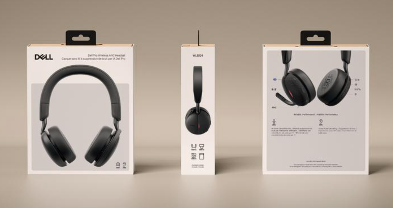
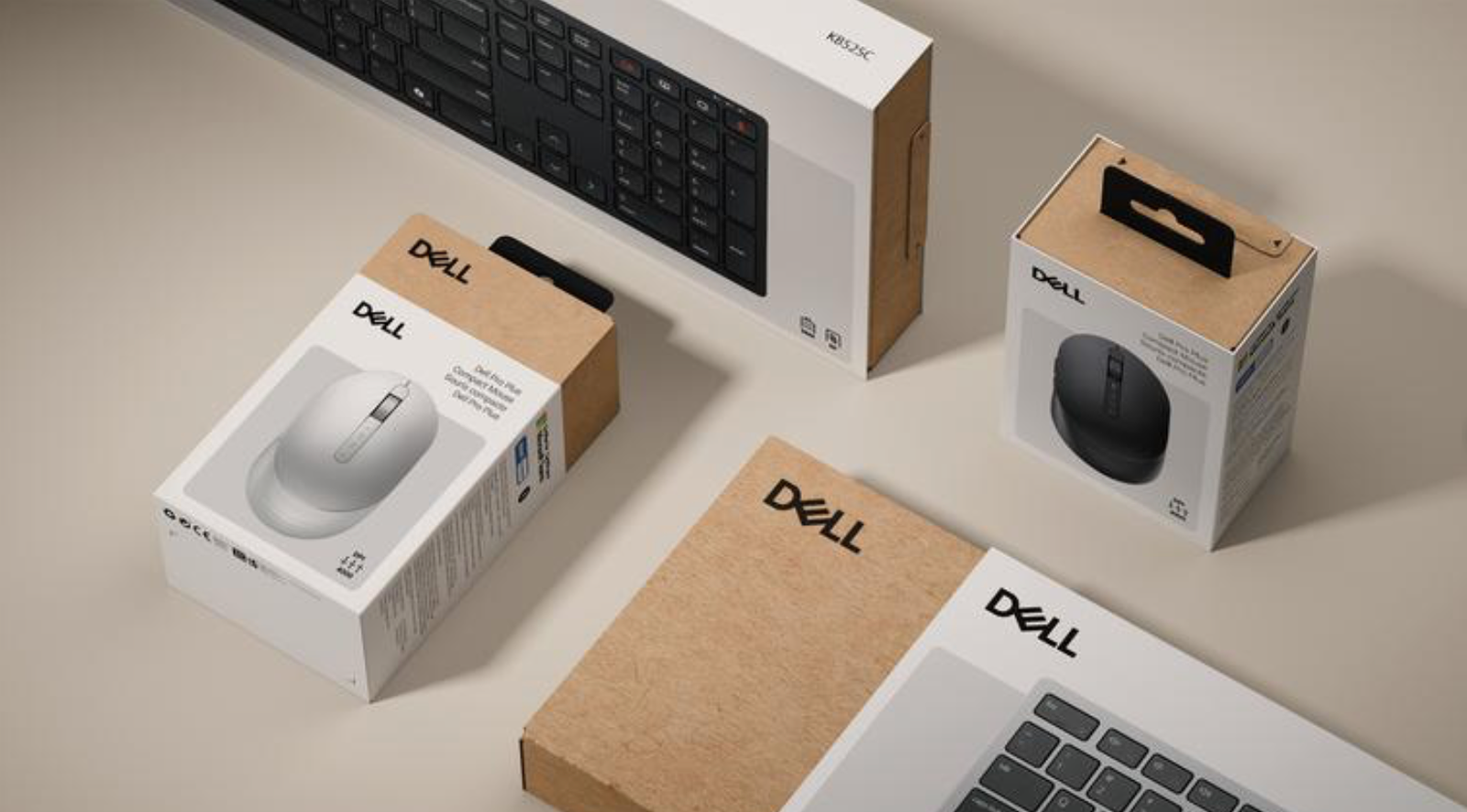
- Premium Retail & CPG Packaging
- Luxury Gift & Limited Edition Sets
- Sustainable & Circular Material Solutions
- E-commerce Unboxing Experiences
- Environmental Signage & Retail Displays
- Photo-realistic 3D Digital Mock-ups
- Brand Identity & Pattern Systems for Surfaces
Ready to turn your product into a destination? Let’s collaborate to build packaging that doesn’t just sit on the shelf — it commands the entire room.

Expert Color Checks
Color doesn’t lie — but substrates do. Every press check is a negotiation between your brand standard and the physical reality of ink on material, and getting it wrong at production scale means getting it wrong on every unit that ships. Gabriel brings a methodical, spectrophotometer-backed approach to color verification: substrate-specific Pantone matching, Delta-E tolerance sign-off, and the kind of press-side discipline that comes from years of signing off on global packaging runs across India, Singapore, and China.
- Pantone-to-CMYK conversion verification across target substrate (coated, uncoated, laminated board)
- Delta-E tolerance assessment against approved color standard (≤2.0 for premium; ≤3.0 general production)
- Spectrophotometer readings at multiple positions across the sheet for density uniformity
- Wet vs. dry ink density comparison to confirm color shift within acceptable variance
- Substrate finish impact review — matte, gloss, soft-touch, and uncoated surfaces alter perceived color and require individual calibration
- Proof-to-production comparison: digital proof, contract proof, and first-article press sheet evaluated side-by-side
- First-article inspection sign-off with documented approval before full production release
- Trap, overprint, and knockout verification under both 5000K viewing booth and ambient retail lighting conditions
Every color that ships under your brand name was either approved by someone who knew what they were looking at — or it wasn’t.